- October 30, 2023
Data Visualisation Tool Report
Frank Li | Actuarial Analyst
October-2023
1. Overview
Azuria Partners has recently developed an excel tool to provide data visualisation to a selected dataset. It provides a visually appealing chart that enables users to make presentations clearer, updates the confidence interval option to obtain the range of possible outcomes, and dynamically adjusts the y-axis bounds.
This article explains the tool’s functionalities and applications. If you would like to request a sample template to create your own tool, please email Frank Li at frankli@azuria.com.au
The ABS released the ‘Population Projections, Australia’ in 2018 and this article chooses to utilise some of their provided datasets for charting demonstration and visualisation purposes.
2. Technical Functionality
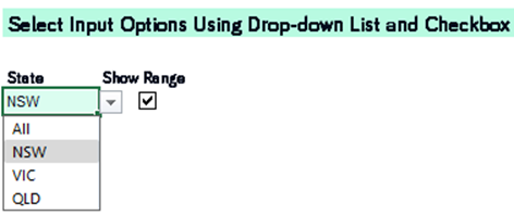

- Formula-driven dataset with indicator and drop-down list All the raw datasets have been consolidated into one merged dataset and an indicator has been set up to specify which state(s) should be plotted on the chart. By selecting the state option from the drop-down list, the indicator will be updated accordingly, and the corresponding data series will be picked up on a formula-driven basis to plot the chart.
- Confidence interval option by checkbox The dataset consists of three data series which are high, medium, and low levels of population projection. The difference between the high and low data series can be expressed as the confidence interval (range). Figure 1 above shows the medium-level population projection and the range for state NSW from 2018 to 2028. Within the excel template, there is a checkbox located above the chart which allows users to include or exclude the confidence interval by ticking and unticking the checkbox.
- Dynamically adjust the y-axis range of the chart The template tool incorporates a customised function within the macro module which can automatically adjust the y-axis range of the chart when the user updates their input option. For example, if a user selects “NSW” from the state drop-down list, the y-axis range will be Min: 7,867,044 and Max: 9,611,425. If the user changes the state to “VIC”, the y-axis range will automatically update to Min: 6,321,642 and Max: 8,230,435.

- Areas able to be overlapped Due to the nature of population projection data, the three shaded areas in Figure 2 above do not intersect. However, when applying this tool to other datasets that require overlapping, with our setting for transparency and color fill, the shaded areas are able to overlap without disrupting the visualisation, making it easier to distinguish one part from another.
3. Application of The Tool
- This visualisation tool provides a clear and useful view of the selected dataset and can be extended to analyse any time series data. The chart can be analysed to draw conclusions on data trends over time as well as make comparison between multiple data series.
- This tool establishes a solid foundation for visualisation and is highly customisable for further iterations, depending on the user’s desired analysis purpose.
- The application of this tool is not restricted to just plotting amounts; it can also handle rates. For example, this tool can take rate of return or fertility rates and plot them based on potential factors that affect these rates.
- This tool can also be expanded to compare different groups or age bands, given other conditions hold constant.
- In our case, we incorporate the state option as the input factor for illustration. However, this tool can incorporate as many factors as the user demands. Common factors in life insurance that people may want to include can be gender, smoker status, occupation, etc.
- If the user chooses one data series to plot as the baseline (100%) and plots other data series in relative to the baseline, the chart will become a ratio/percentage visualisation.
4. Make Your Own Tool
The excel template is available upon request, providing details of the population projection charts above. It also offers users instructions for incorporating more tailored features that suit their needs, allowing them to create their own visualisation tool for analysis.
5. Conclusion
Azuria Partners has created an excel model for data visualisation, offering various features such as confidence interval option and dynamic range adjustment. This tool can be used to present your ideas more clearly, convey the variance of future outcomes effectively, and adjust the y-axis range efficiently without the need for manual reformatting operations.
6. Reference
If you would like to request a template of the tool or have any questions, please feel free to contact Frank Li at frankli@azuria.com.au